

The traditional formula of header, footer and sidebar of a website design has changed into a no formula design with coming of responsive age. This has lent web designers more creative freedom than before. All the trends aim at a clutter free simple but impactful website design. In 2015, a design is considered complete when all the unnecessary elements will be removed.
A Bit More Realistic
Opt for a distraction free flat design, use rounded corners, gradients and shadows to make the website design a little more realistic. iOS 7 is a great example of simplistic and a realistic design.
Mark It With Typography
To maintain and display hierarchy of the content you can use typography to differentiate between the content. Typography has lately been becoming more and more important and in 2015, it is the most important element of a website design. Large and varying sizes of the fonts helps the content to stand out and to increase its readability.

Imagery
Care free beautiful illustrations being used now a days helps in breaking the monotony of an otherwise boring website and also lends attention to minute details which are omitted otherwise. Customized images instead of stock images provide a professional and unique approach to your web design. This helps in communicating the brand philosophy in a better and unique way.
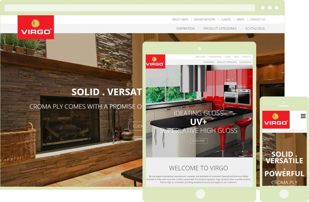
Mobile Friendly Mobile friendly approach had its say in 2014 and is ruling in 2015 also. Hidden navigation bars like ‘touch me not plants’ which respond or show when the user interacts with the website and circular figures for call to actions to give it a more realistic feel like buttons in real physical world, mark the coming of ‘mobile first’ approach.
